Skip to content
City PM
  • Germany
  • France
  • Europe
  • Markets
  • Business
  • Opinion
  • Germany
  • France
  • Europe
  • Markets
  • Business
  • Opinion
Thursday 17 July 2014 10:30 am  |  Updated:  Friday 07 June 2019 1:18 am

Why London should be proud of Airbnb’s new “rude” logo

By: Gabriella Griffith

Add as a preferred source on Google

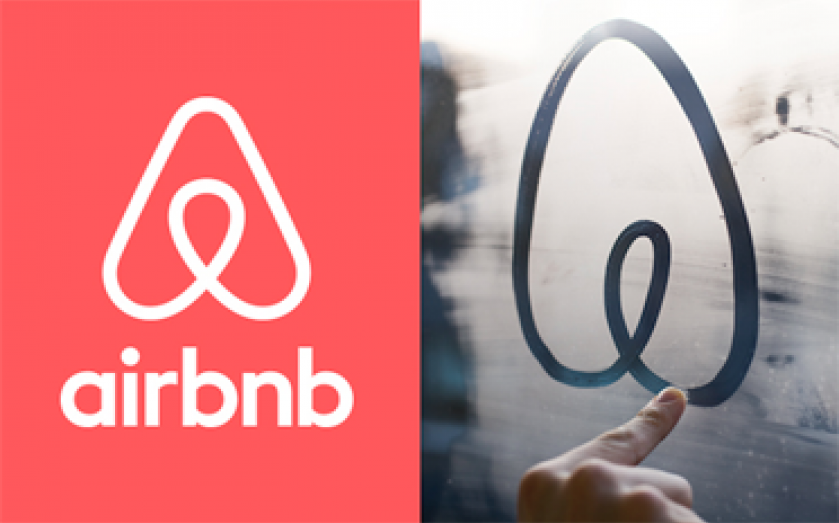
When Airbnb launched its rebranded logo in San Francisco last night, it knew it would get a fair bit of attention but it couldn’t have anticipated that the new logo would be trending at number one on Twitter for eight hours.
 
But is was. And why? Well, people think it’s a bit rude. And they’ve gone on and on about it ever since.
 
There's a very rude Tumblr account we couldn't possibly lead you to and lots of tweets. 
 
https://twitter.com/nomadicmatt/status/489650061895565312
 
https://twitter.com/amtaylor87/status/489754093552812032
 
But as they say, no publicity is bad publicity – and there’s hardly an internet junkie out there right now who doesn’t know the travel company has had a redesign. All eyes are on the company behind the work, an agency based near Old Street called Design Studio. 
 
We caught up with its founder to see what he makes of all the noise. 
 
“We’ve been overwhelmed by the reaction, Airbnb is an incredibly company, to be the company that rebrands them is an amazing opportunity and we knew there would be a lot of interest but we weren’t expecting quite so much,” Ben Wright told City PM 
 
The design is based on the idea of people, love, places and the A in Airbnb. Wright told us he had no idea the shape of the logo would inspire so many people to think of rude er, shapes. 
 

The thought process behind the logo (Source: Airbnb)

 
“No we didn’t see that coming. But it doesn’t worry me – it happens all of the time, the internet is a good thing, it enabled freedom of speech and there have been some incredibly creative reworkings of our design. That’s the magic of the internet.”
 
While us filthy-minded folks have been giggling about how much the shape looks like certain things, the rebrand has been well received in the design community. 
 
“I don’t think there’s been any bad publicity and design blogs as well as our peers have said they really like it – Kelly Hoppen tweeted about it earlier,” he added. 
 

Very nice and clever #design RT @Design_Week The story behind the new @airbnb identity, created by @_DesignStudio_: http://t.co/mmvAWEHiuf

— Kelly Hoppen MBE (@IMKellyHoppen) July 17, 2014

 
Can’t argue with support from a Dragon.
 

Share this article

  • Facebook
  • X
  • LinkedIn
  • WhatsApp
  • Email

Similarly tagged content:

Sections

  • News

Categories

  • Business

Related Topics

  • Airbnb
  • Sharing economy

Trending Articles

  • Top Burnham adviser calls for capital gains and inheritance tax hikes

  • A meeting with the breakfast king of Mayfair

  • Housebuilding giants hit with £4.5bn lawsuit for allegedly overcharging buyers

  • As it happened: Stocks jump on defence and metals boost; Oil on track to shed a fifth on US-Iran peace hopes

  • BT tops FTSE 100 after finding new home for international business with Verizon joint venture

More from City PM

  • The Debate: Is Gen Z right to reject corporate culture?

    Opinion
    1955 secretary overwhelmed by towering stack of files, symbolizing challenges in office management and document handling
  • Don’t Miss Alobayyah in competitive Kensington Palace

    Sport
    GettyImages 1708016652
  • Squash players turn to social media to cash in on LA Olympic Games opportunities

    Sport Business
    GettyImages 650503196 shows a professional business meeting in a modern conference room, highlighting diverse executives c...
  • England Red Roses are great for rugby, but are they bad for business?

    Sport Business
    Business professionals discussing market trends in a modern office setting, emphasizing collaboration and innovation.
  • Cole Palmer: Chelsea footballer launches range of ‘premium craft ice’ for £2 a bag

    Sport Business
    Getty Images logo prominently displayed against a blurred background representing stock photography and visual media services
  • The Debate: Should CEOs be held personally accountable for cyberattacks?

    Opinion
    Evil-looking keyboard symbolizing cybersecurity threats and hacking risks in a digital landscape.
  • Halfords eyes garage growth after wheels fall off cycling boom

    Retail
    Halfords store exterior showcasing signage and entrance, highlighting the brands presence in the retail automotive sector.
  • Polestar 3: Swedish electric SUV delivers premium performance

    Life&Style
    Polestar 3 electric SUV in sleek urban setting showcasing modern design and advanced technology features

City PM — European politics, business and analysis.

Europe

  • Germany
  • France
  • Europe
  • UK & Ireland

Topics

  • Business
  • Markets
  • AI
  • Technology
  • Opinion
  • Energy

More

  • Politics
  • Economics
  • Fintech
  • Legal
  • Sport
  • Life

Company

  • About City PM
  • Editorial Policy
  • Corrections
  • Contact
  • Terms of Use
  • Privacy Policy
  • Cookie Policy
© 2026 City PM · Published by CityPM Media, Bahnhofstrasse 65, 8001 Zürich, Switzerland
About · Editorial Policy · Corrections · Contact · Privacy